Overview
Organization: Gift Cards & Incentives, Amazon
Role: Manager
Designer: Marisol Bowman, Sr. Visual Designer & Erin Zingré, Sr. Visual Designer
Problem: The design of the cards that appear in stores had not been updated since initial launch and contained a logo that is no longer supported by the Amazon brand. As we were launching to other countries, we had to quickly create solutions quickly individually. It was time to spend time to invest in a worldwide system.
Measures for success: Raise the bar for designs to create a global look and feel that reflects the current Amazon brand, with clear standards that help the team scale quickly to new countries.
Context
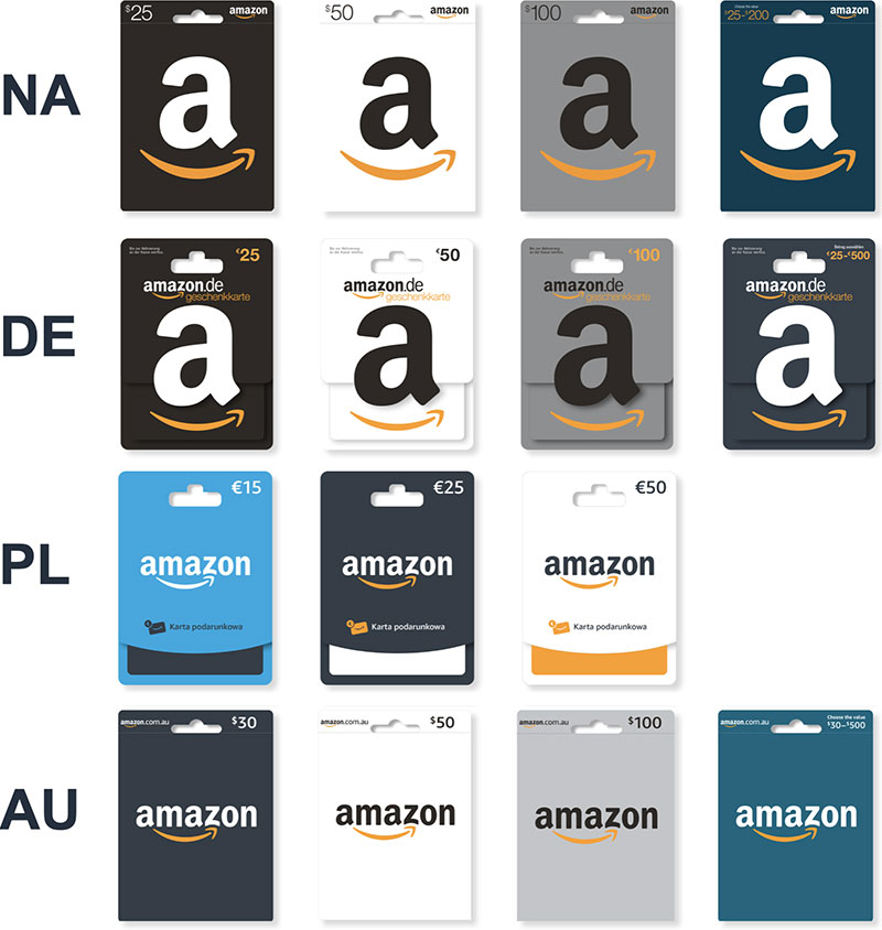
The design of the Brick & Mortar (B&M) gift cards and their packaging, called carriers, had a number of brand inconsistencies and there is no standardized template in place. Without systematic guidelines for global use, the level of quality across marketplaces did not meet the bar consistently and it impacted the speed which we could launch to new regions. At the time, the EU was switching the form factor for their carriers, so they would be requiring all new files so it was perfect timing for standards to come into play.This was the first change in this form factor in 9 years and the stakes were high since these can last on shelves around 3 years so it would take a long time to transition and a long time to change if there were any issues.
As the manager and leader of the team, I advised the designers along the way, providing feedback, facilitating and overseeing peer feedback, helping with the transition as the project was picked up by Erin, and helping remove roadblocks for everyone.
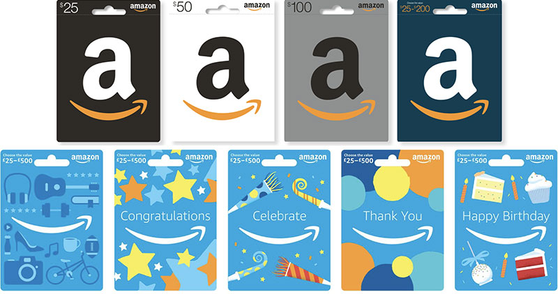
Examples of the core collection carriers prior to the redesign
Design goals
After auditing the competition and doing an analysis on the current designs, the team created design goals. They included making a new worldwide system that not only aligns with the Amazon brand, but stands out to customers on shelves as recognizably Amazon, is easily scalable to other countries, and outlives short-term design trends.
Process
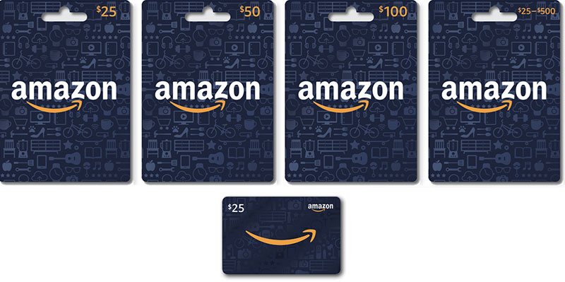
While most of the process is confidential and I can't show in-progress iterations, I can share that the team did lots of iterations of many different directions, layouts, color combinations, and finishes. We tested these in focus groups and surveys in select countries to represent different regions, and iterated on those findings and tested again. Specifically we learned about what logos and colors stood out the most to customers as Amazon and thought holistically about how these products would fit together as a system and live amongst competition. We narrowed in on system with all one color background to create a strong "brand block" on the shelf, a similar choice to what some of our competitors had done. We also made more subtle changes like changing the side that the amount is on to be quicker for customers scan in context with competitors, who already have it on that side. And we added a delightful background of icons to abstractly point to the vast selection Amazon can choose from, illustrated in a timeless form in a subtle, delightful finish on the dark background.
One of the key contributions I made was when the director was not convinced of the direction of using icons, despite qualitative data pointing to it being a favorable direction for customers. His concern was that the icons were a fad and would not hold up over time. I suggested creating a slide to have in our back pocket reflecting the symbol system from the 70s created by the AIGA and U.S. Department of Transportation (DOT), pointing out how that had held up over time and that our icons were in a similar style. Sure enough, there was push back again and we brought up the slide and I was able to convince the director to be aligned with the icon direction.
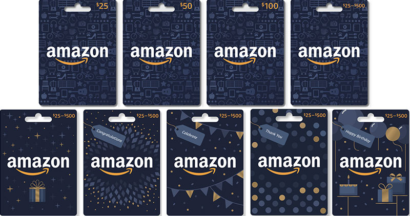
The only difference in different countries is the currency, translation, and a URL at the bottom of the carrier to distinguish which site to use it on.
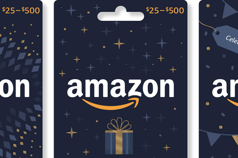
The core collection carriers after the redesign
Note that the light blue represents where the gloss is.
Extending the system
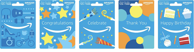
Now that the core collection was done, we started working on the occasion collection. It was outdated, and with a childish tone not in line with our brand.
The occasion collection before the redesign
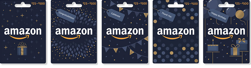
We used a similar process, iterating and testing to have confidence in our final direction. The redesign not only matched the core collection, to further build the brand block on shelves, but featured gold foil accents in each to celebrate the festive occasion.
The occasion collection after the redesign
Results
The new system met all of the goals, both for the business and the ones the design team had identified. It featured the updated logo and imagery and colors that resonated best sticking out to customers as Amazon. Crucially, the new system made launching to new countries much faster and design was no longer a bottleneck for launches.
The entire NA collection before the redesign
The entire NA collection after the redesign

-
 Website redesign Maya Traditions Foundation
 -
 Org Central launch AmazonSmile, Amazon
 -
 Welcome email redesign AmazonSmile, Amazon
 -
 Feature launch AmazonSmile, Amazon
 -
 Feature redesign AmazonClicks, Amazon
 -
 Heart of Haiti launch macys.com
-
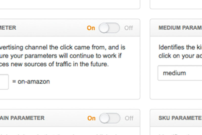
 UX example Gift Cards & Incentives, Amazon
 -
 Visual design example Gift Cards & Incentives, Amazon