Overview
Organization: Gift Cards & Incentives, Amazon
Role: Manager
Designer: Michael Goldkamp, UX Designer
Problem: Redesign the Incentives microsite to increase comprehension, scalability, SEO, accessibility, and alignment with the brand
Measures for success: Increased traffic to sign up for the Incentives program, and increased sign ups
Context
The Incentives microsite on Amazon lets companies discover the Incentives program, which empowers companies to buy Amazon Gift Cards in a variety of forms in bulk. The experience was confusing and unnecessarily complex and well overdue for a makeover. Visually, it looked outdated and it didn't match the brand. It also featured lots of text as images, which cut down on accessibility, SEO, and scalability as we launched in new countries.
As the manager and leader of the team, I advised Michael along his entire journey redesigning the site, providing feedback, facilitating and overseeing peer feedback, and helping remove roadblocks for him.
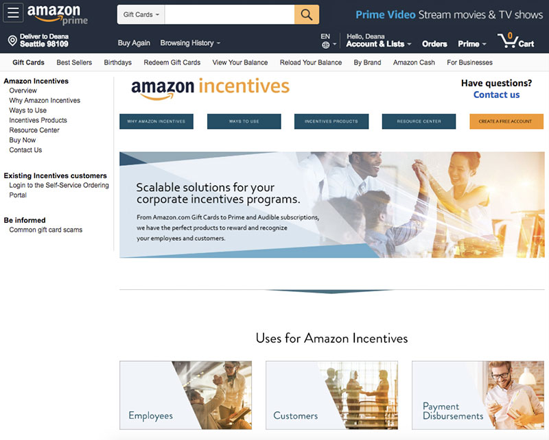
The microsite before Michael's redesign
Research
One thing that Michael lead to collect information was a "Walk the Store" session where people broke up into teams and walked through the experience to identify issues to share with others. Lots were identified and that was one input to the project. He also did extensive interviews with account managers that work closely with the clients to learn what those clients actually want. Through that and working with stakeholders, he created personas of the people we are targeting and solving a problem for.
Architecture
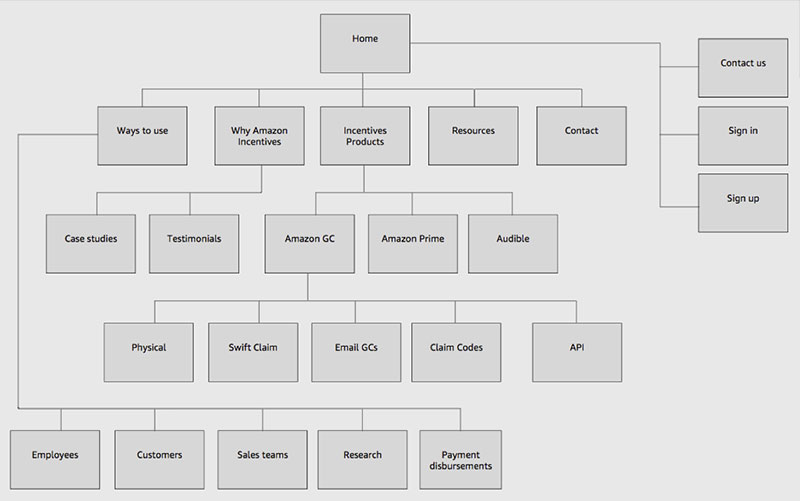
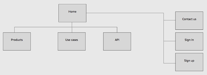
One of the clear issues was how deep the site was, often wrapping back around. It felt like a maze that never ended, which was neither good for our clients or good for Amazon because it was hard to find how to take the next step, or even understand what that was. Michael ruthlessly pruned and stripped the content and restructured the site to focus on the information the customer needed in that point and time and completely reworking the content to be focused starting with the client and working backwards, easy to understand and with clear next steps and leveled expectations. The original sitemap had five layers and 24 pages. Michael's solution had only two layers and seven pages.
The microsite's sitemap before Michael's redesign
The microsite's sitemap after Michael's redesign
Other steps
While I can't share many details of the process due to NDA, Michael went through a wireframe stage before conducting usability testing on a few actual clients. He then iterated on his findings and created high fidelity mockups that reflected the latest direction from brand, but also a solution where text was outside images so it could be maximized for scalability, for translations and launches to new countries and updates from marketing managers. Crucially, while we had to use stock imagery, we made sure to include diversity in the people represented in the images.
The redesigned microsite

Results
While I can't share the specifics of the results, it smashed the metrics so much that it became a flagship example of what the impact of UX can have on business. It also resulted in a much more modern, clean, and scalable experience.

-
 Website redesign Maya Traditions Foundation
 -
 Org Central launch AmazonSmile, Amazon
 -
 Welcome email redesign AmazonSmile, Amazon
 -
 Feature launch AmazonSmile, Amazon
 -
 Feature redesign AmazonClicks, Amazon
 -
 Heart of Haiti launch macys.com
-
 UX example Gift Cards & Incentives, Amazon
 -
 Visual design example Gift Cards & Incentives, Amazon