Overview
Organization: AmazonSmile, Amazon
Role: Only designer (UX + Visual)
Problem: Not all customers who selected a charity to support later returned to shop at smile.amazon.com
Measures for success: Increase in direct traffic to smile.amazon.com
Problem definition
While the business had several goals for redesigning the welcome email, there were also many reasons from the design side to redesign it as well.
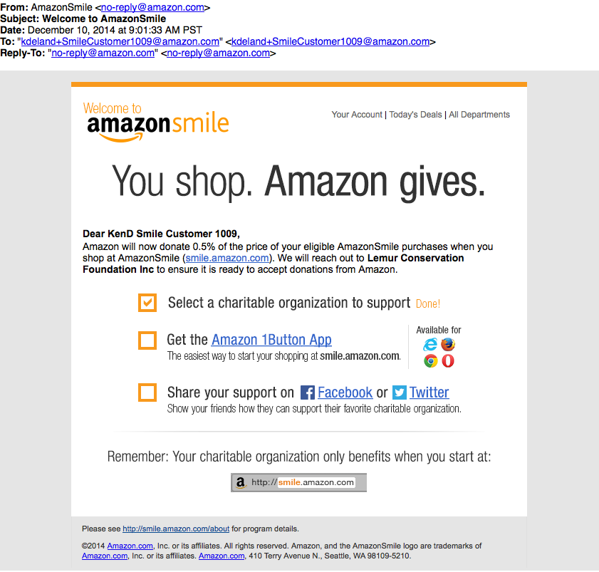
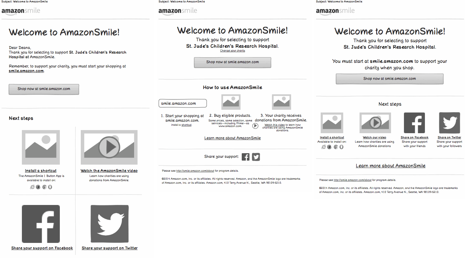
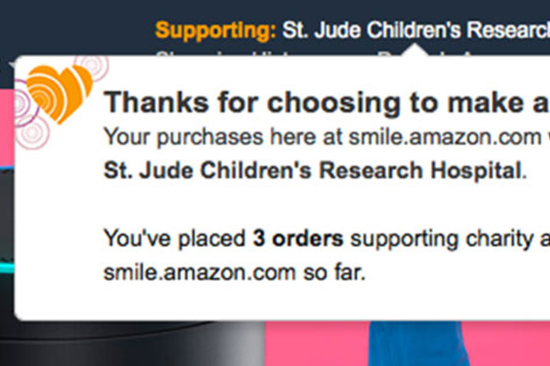
The welcome email before my redesign
Business goals
This list is in order of priorities based on my meetings with the stakeholders and diving deep as to their needs and reason for the project.
- Get more customers to return to smile.amazon.com directly when they shop after their initial charity selection there
- Have more customers install Amazon 1Button App (to drive #1)
- Have more customers watch video (to drive #1)
- Have customers share AmazonSmile with their friends
- Meet legal restrictions
Design goals
As the head of design at AmazonSmile, these goals were determined by me and reflected the goals that were crucial from a UX and visual design standpoint.
- Make the email more on-brand
- Make the email easier to scan
- Create cleaner hierarchy so main messages get through to the customer
- Make the email more modern, clean and visually appealing
- Make the email more mobile-friendly
User research
Due to budget and bandwidth constraints, we were not able to complete official user research for this specific project, but we did have some data from usability testing that we had done to analyze the initial sign up experience at AmazonSmile that I leveraged to help target what customers might be unclear about after they sign up for AmazonSmile. If I had been able to do user research, I would have recruited customers who had never heard of AmazonSmile before and do a task-based usability test of them selected a charity for the first time at smile.amazon.com. Once they’re done, I’d ask them non-leading questions about what they’ve learned about the program and questions surrounding what they’d expect to receive in a welcome email.
What customer questions did other welcome emails typically answer?
- What action did I take that caused me to get this email?
- Why should I feel good/cool because of what I just did?
- What is this program?
- What are some features/perks of what I just signed up for?
- What should I do next?
- What is the personality of the thing that I just signed up for? (Friendly/serious/etc.)
Selecting content and hierarchy
After cementing the goals of the project and diving deep on competitive analysis, I created a list of communication goals to help drive our decisions about what we were going to include and the hierarchy that we would display that information in.
Prioritized communication goals
- Welcome to AmazonSmile
- Confirmation of charity you just selected
- Reinforce that AmazonSmile has a separate URL, smile.amazon.com, than www.amazon.com
- Amazon 1Button App
- Video
- Share your support on Facebook & Twitter
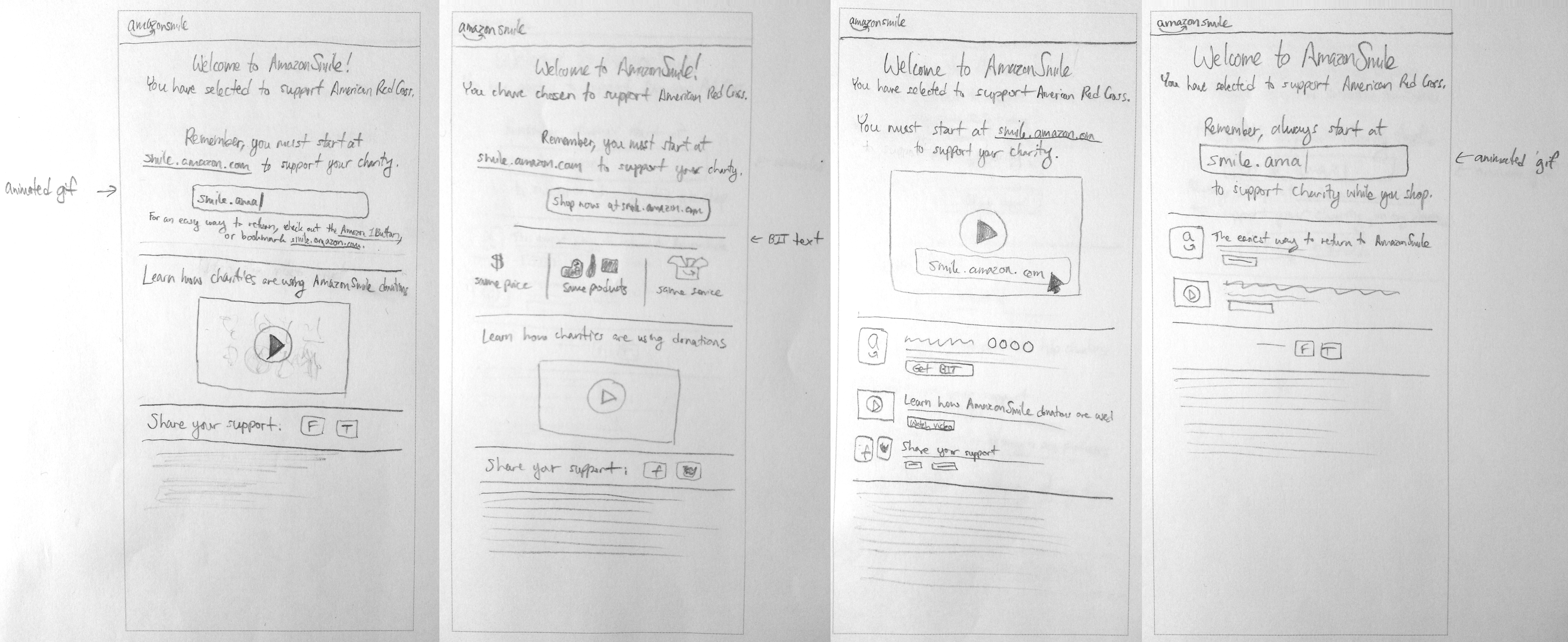
Pencil sketches
My next step was to create quick pencil sketches to get my initial ideas down on paper.
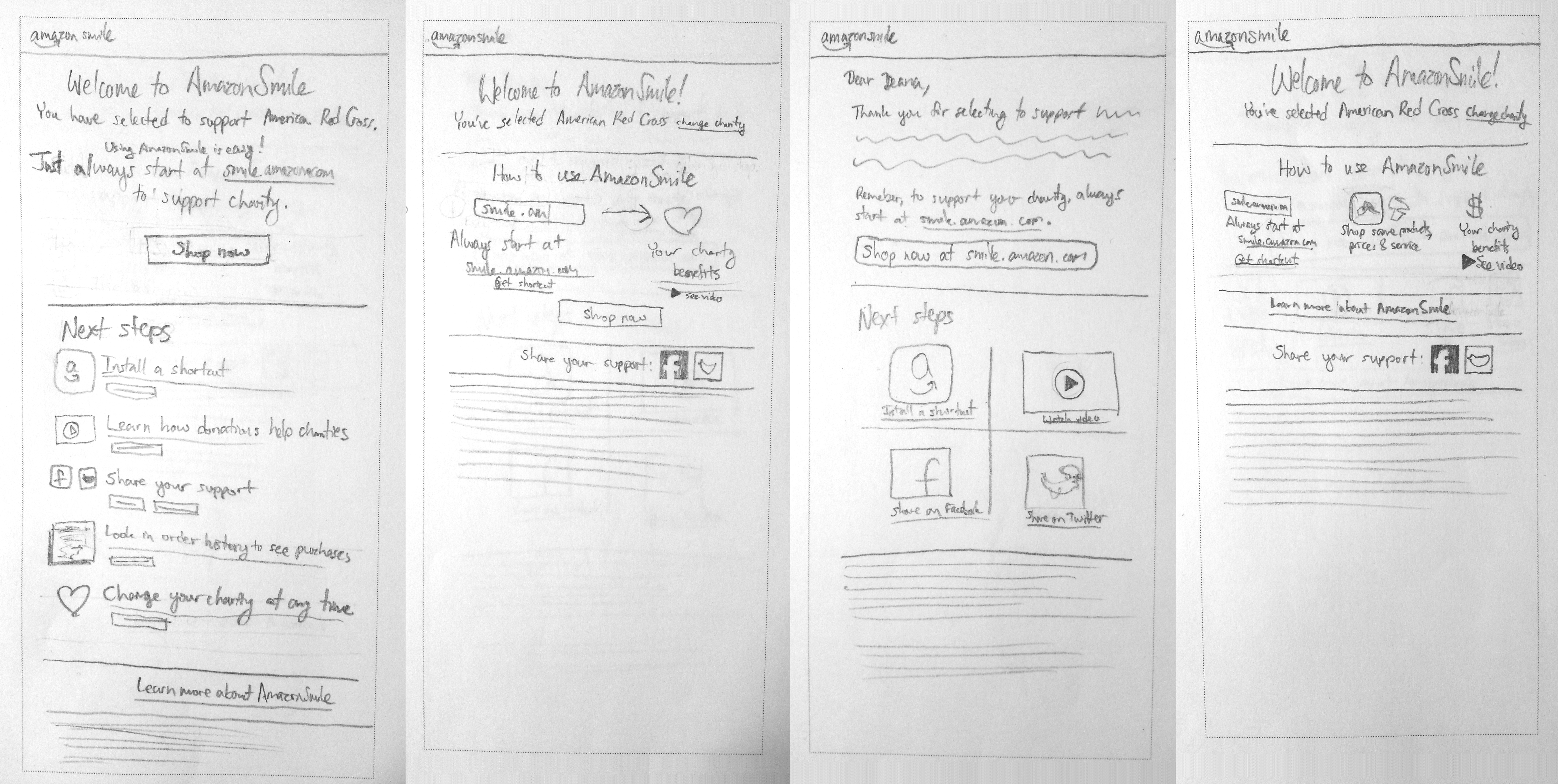
Computer sketches
From there, I moved to the computer and started rough sketches in Axure. To move quickly, I brought printouts of 14 of these sketches to a meeting with the primary stakeholder and together we rolled up our sleeved and narrowed them down to a handful of directions we wanted to pursue to the next step of visual design. We also started working on revising the copy.
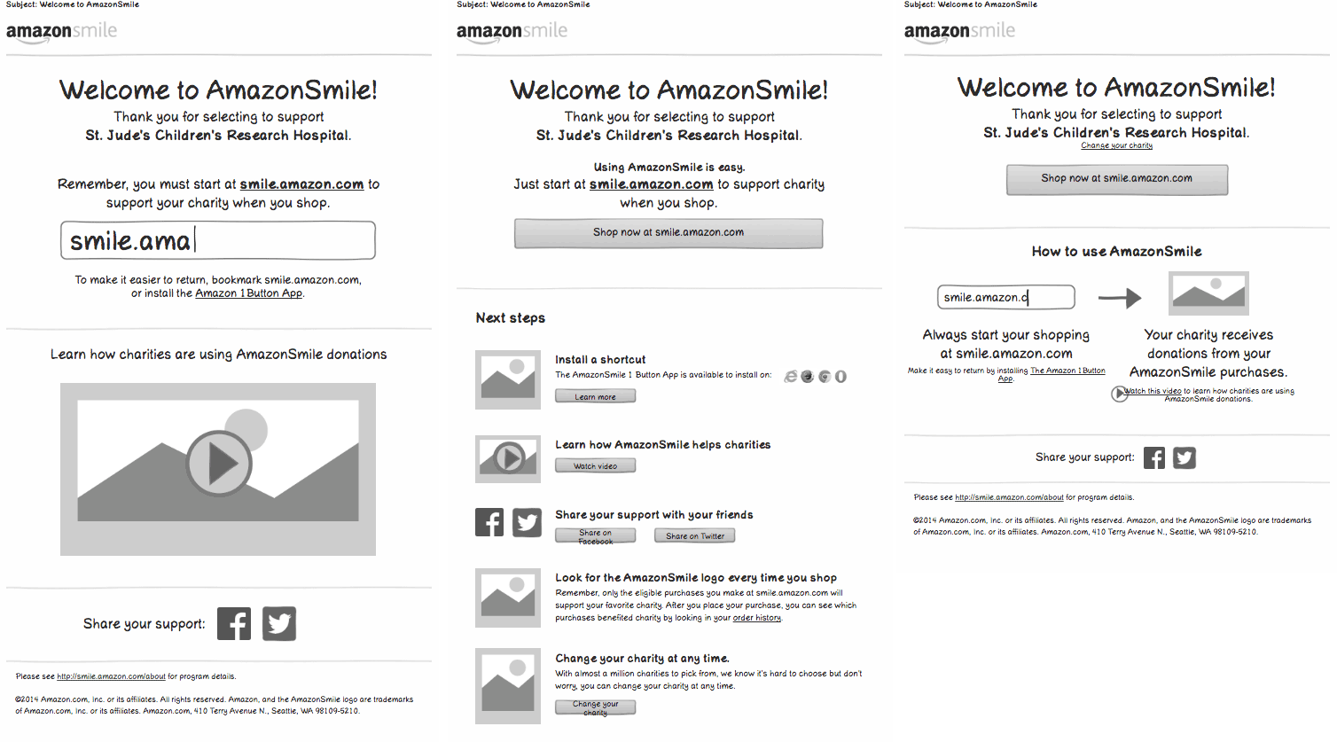
High fidelity
With a solid plan in place, it was time to take this project to the next level with high fidelity mockups. I iterated many versions and consulted with the head of design for email at Amazon to make sure I was leveraging best practices and making it as mobile-friendly as possible. The biggest change that came out of this was decreasing the width of the email to 500px.
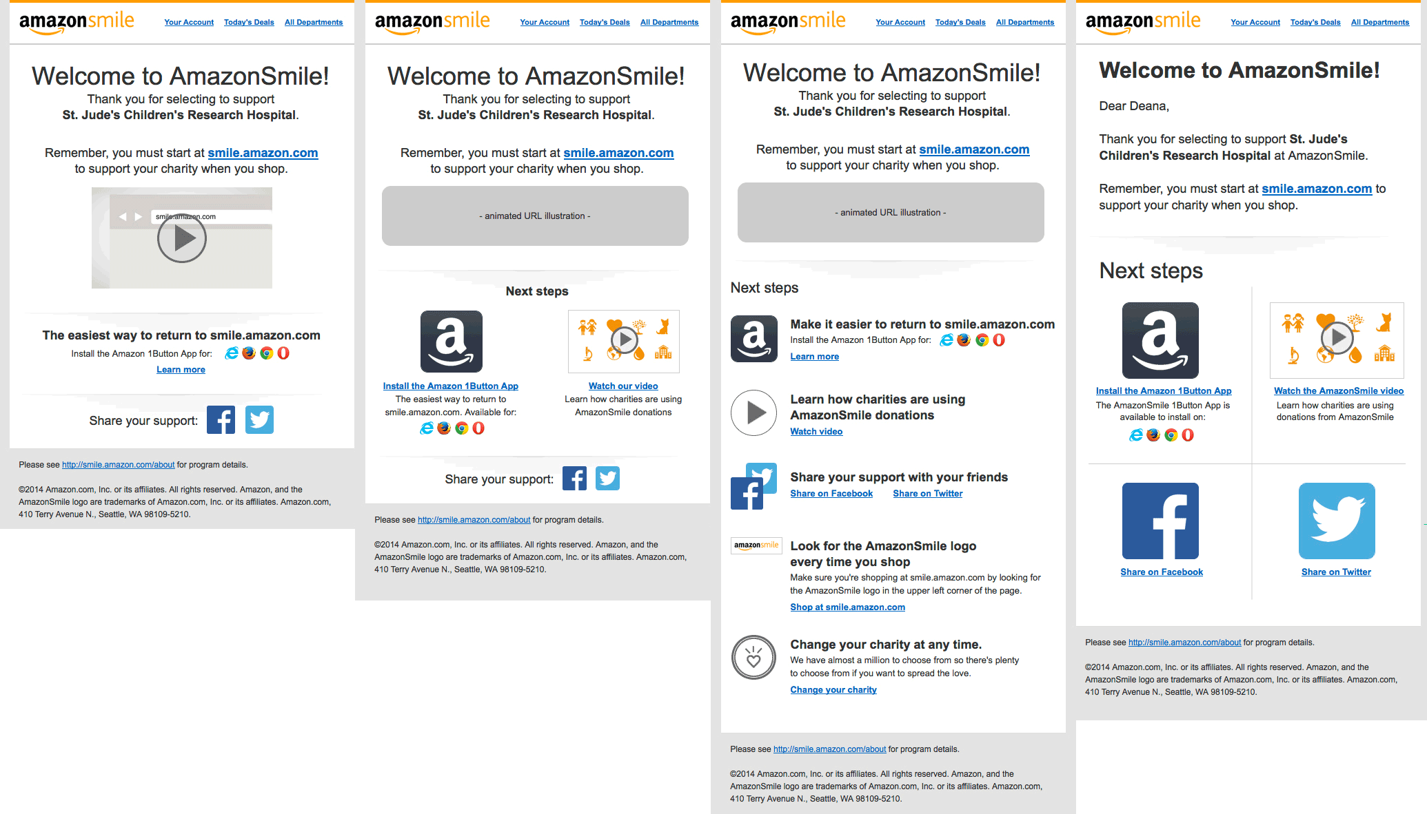
Final design
After several levels of reviews with stakeholders, we narrowed the mockups down to the final design, which featured my animated gif concept to bring attention and visual interest to the URL.
Usability testing
Due to budget and bandwidth constraints, we were not able to complete usability testing for this specific project so I leveraged best practices proven in other projects, like the email width, as much as possible. If I had been able to do usability testing, I would have recruited customers who had never heard of AmazonSmile before and do usability testing to watch them register and receive this email to find out how they would interpret and take action on its contents.
Execution
I optimized images and worked closely with the development and QA teams to make sure the final email matches the intention of the final design.
Animated gif
Results
We launched the new email in an A/B test against the old email with significant positive results (specifics are confidential) against our top business goal. We will take the data from this test and use it to continue to improve the email in the future.

-
 Website redesign Maya Traditions Foundation
 -
 Org Central launch AmazonSmile, Amazon
 -
 Welcome email redesign AmazonSmile, Amazon
 -
 Feature launch AmazonSmile, Amazon
 -
 Feature redesign AmazonClicks, Amazon
 -
 Heart of Haiti launch macys.com
-
 UX example Gift Cards & Incentives, Amazon
 -
 Visual design example Gift Cards & Incentives, Amazon