Overview
Organization: Maya Traditions Foundation
Role: Only designer (UX + Visual) through finalizing vision, then lead designer (over a visual designer and web developer) during execution
Problem: The non-profit wanted to attract more customers
Measures for success: Increase in volume of potential customers reaching out to partner
Context
Maya Traditions Foundation is a non-profit based in Panajachel, Guatemala, that has been helping the Maya since 1996. They empower skilled indigenous women artisans to sell their beautiful handmade textiles and textile products to customers all over the world, mostly in the U.S.
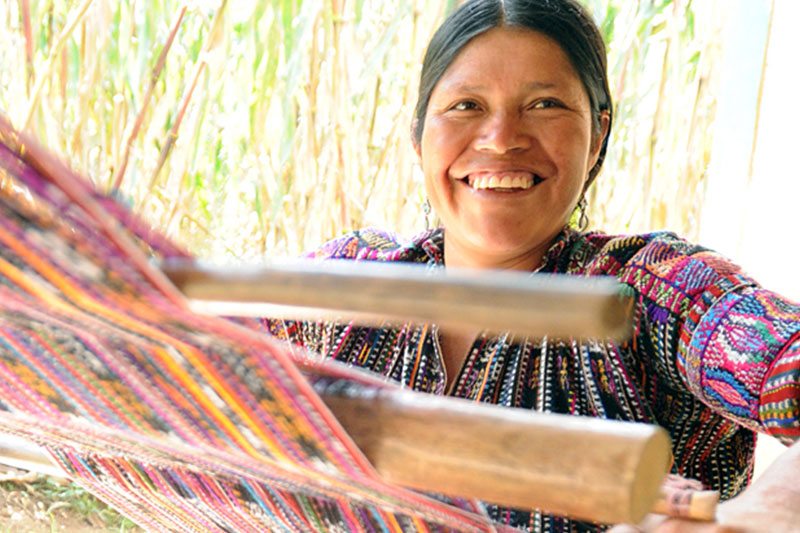
To understand the Maya culture and truly be able to emulate their energy and essence visually, I journeyed to Guatemala for a week to meet them in person in their village and photograph them myself. The project itself lasted 8 months. (I did the rest of the work remotely from Seattle.)
I was connected with MTF through MovingWorlds when I was looking for an experteering (volunteering leveraging your unique expertise) project to do in spring 2014 and our partnership began in May 2014.
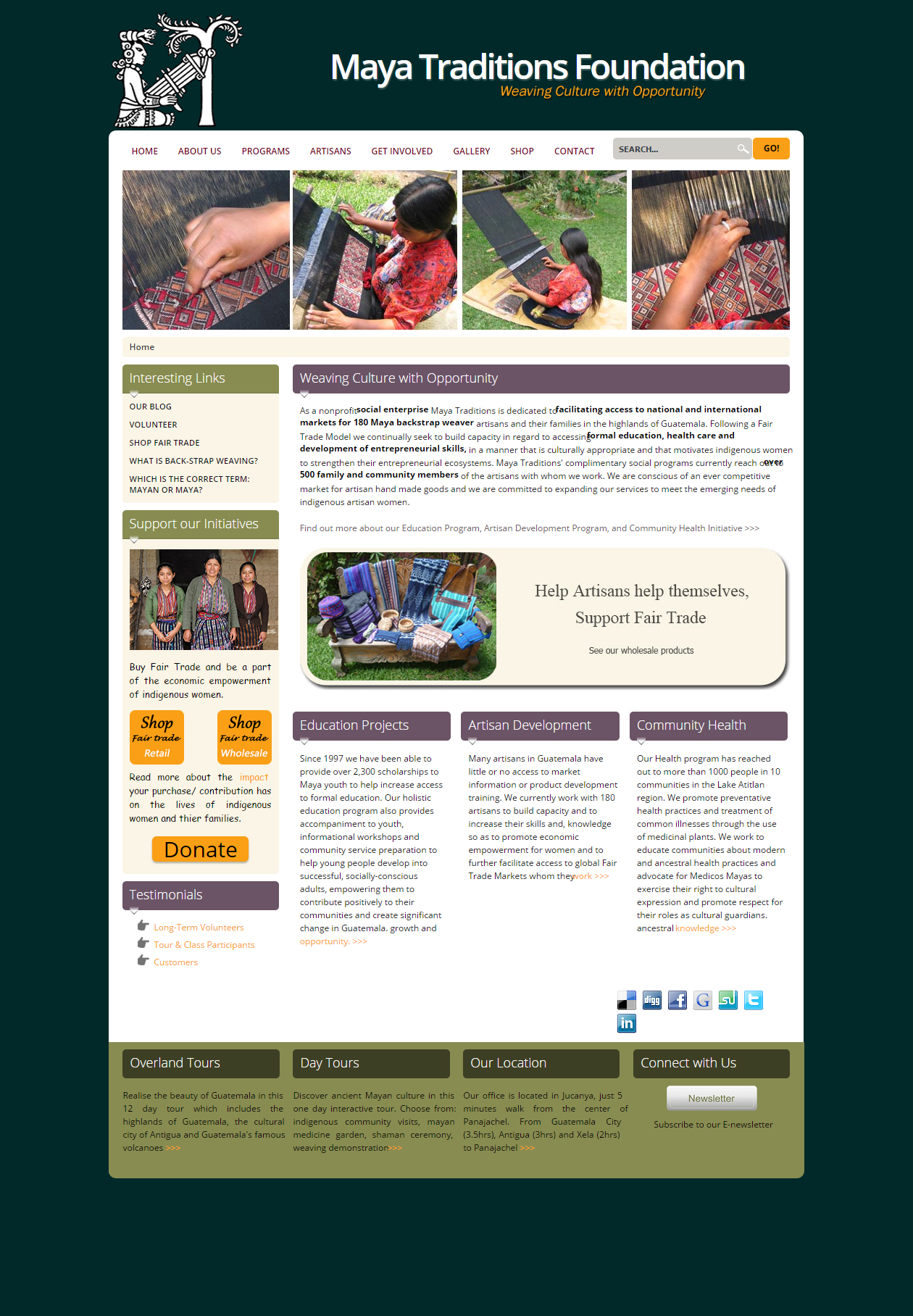
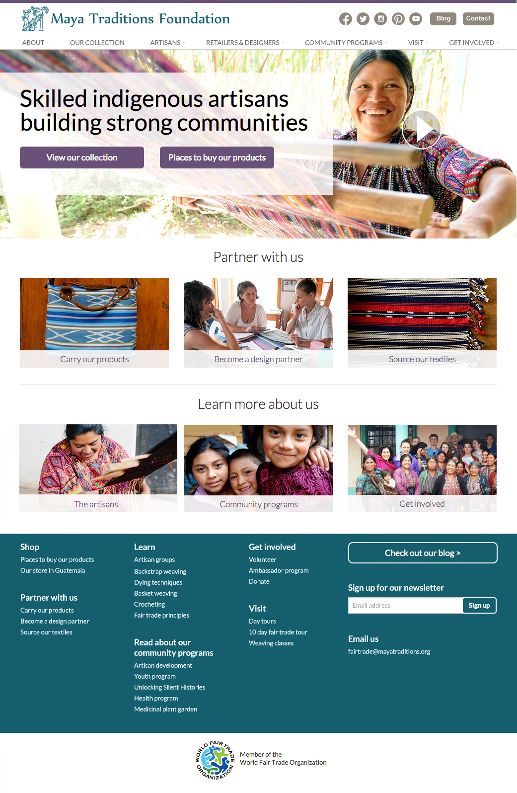
Their website before my redesign
Defining goals
The initial ask from MTF was just for a visual refresh, but I dug deeper and identified more opportunities to improve the experience. Through a series of Skype meetings, I further defined the problem that we were trying to solve as I learned more about MTF and their organization’s goals, how they envisioned success for this project looked like, and contrasted those things against the current website. Not only did the site need to visually look more modern and professional, but it needed to be easier to navigate and most importantly, better communicate what MTF does and the different ways that customers can partner with them.
Their initial goal
- Visual refresh to look more modern and professional
New goals that I identified after initial analysis
- Visual refresh to look more modern and professional
- Make it easier to navigate
- More clearly communicate what MTF does and its mission
- More clearly communicate the different ways that customers, especially designers, can partner with them
- Sustainability by building the new site in a way that will be easy and flexible for MTF to update without needing to learn how to code or other technical skills
User research
The next step I took was to learn more about the customers that they most wanted to target, designers and other sourcers of textiles in the U.S. market. I leveraged some of my personal connections in this field who had not yet worked with MTF, and MTF also connected me with some of the designers that they were already working with. I then held interviews, (through Skype meetings and emails,) with each to learn more about their needs and desires when analyzing potential partners like MTF, as well as the lingo they use to describe certain aspects, their impression of the current website, and what the experience of working with MTF was actually like.
Key learnings
- Mental models and domain-knowledge terminology around how the designers and MTF partner
- Quality and consistency are some of the most important and defining differentiators for designers
- When visiting the old site, designers weren’t sure if MTF would be interested in partnering with them or not.
- Designers love working with MTF, and the director of sales and marketing in particular, and especially appreciate their flexibility to work with them and execute exactly to their custom design requests
- Designers were initially confused about how long projects should take and how pricing worked
Competitive analysis
I also ran an analysis of competitor’s websites to evaluate any patterns that might be expected to someone who frequents these kind of websites, and to compare and contrast how each organization represented itself.
Key learnings
- Sites consistently posted about their artisans
- How products were displayed varied greatly between sites
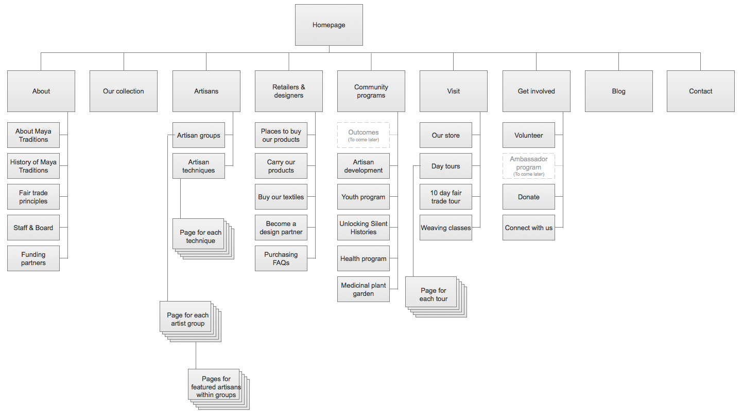
Architecture
SitemapAs I dug deep on the current website, there were some crucial issues with how the website was structured. I analyzed these and proposed revisions to the stakeholders.
Key issues with old website structure
- Felt like a rabbit hole maze with a very deep structure, with pages leading to other pages into the site without consistent naming or breadcrumbs to help someone establish where they are
- Prominently featured a shopping section when it was not an ecommerce-enabled site
- Centralized gallery of small, poor-quality images
- Blog existed as a separate website
Improvements in new structure
- Clear, organized and less deep structure
- Replaced shopping section with sections that speak to each way to partner with them
- Eliminated gallery section by enhancing entire site with high-quality images that engage the visitor as they navigate through the site
- Adding the blog as a section within the website
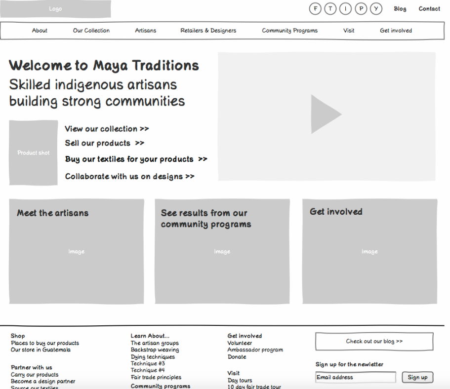
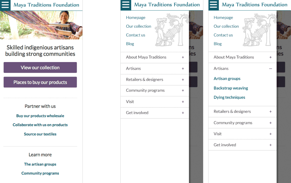
Wireframes
After we finalized the site map, I created click-through wireframes for each page in the new structure. This helped the stakeholders and I determine what content would appear on each page and helped them start to plan what additional content they would need to create for the new site. Keeping the wireframes sketchy helped us have productive conversations without being distracted by what the site would look like visually.
Visual design
Iterating the look and feelOnce we finalized the wireframes, I started iterating on the look and feel. I wanted to make the content and beautiful photography the stars, but also enhance them with a vibrant color palette that reflected the Maya. It was very important to use a modern, clean aesthetic and tone that would resonate and instill trust with the designers. I created different visual treatments, mocked them up with sample content and context, and shared with the team for feedback to help narrow down our direction.
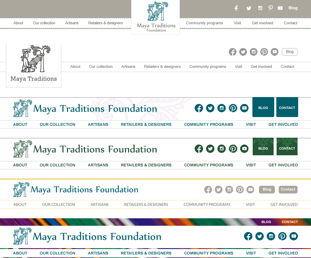
Some of the top navigation explorations
Final visual design
Responsive considerationsWe had learned that initial discovery is done through laptop devices, so we started with desktop (although usually as a best practice I start with mobile first.) Mobile considerations were important for the MTF website since their customers occassionally physically come to Guatemala to visit, where they would likely be accessing the site on their mobile devices on weak local Wi-Fi. For this reason, we made sure to make the mobile site especially fast to load, including replacing the homepage video with an image, and eliminating imagery in other areas of the site.
Usability testing
I went back to the designers that I had interviewed before and did remote usability testing with them to learn if the new designs were actually working better. I put these together into a report that I gave to MTF.
Key findings
- They consistently were able to finish all tasks successfully.
- Designers loved the new look and feel, especially the color palette
- Designers loved the instructional pages about process, all thought it would be very helpful
Key quotes from usability testing
- “If their site looked like this when I was looking, I would have just gone with them and not even bothered to contact other organizations.”
- "Color is so much better, building on a white background… green was so drabby"
- "[The “Become a design partner” page] is very useful and would have answered a lot of the questions that I had at the beginning...This teaches more than they learned even being there in person!"
- "It’s great that [the “Become a design partner” page] has time and price and is realistic."
Key changes made in response to usability testing learnings
- Made the “email us” CTA stronger/more discoverable on the designer instructional page since it was not found as quickly as other elements
- Tweaked content to make it more obvious that other materials besides backstrap weaving was available.
Execution
DesignOnce we finalized the look and feel of the site’s homepage and a few key interior pages, a full time graphic design volunteer joined the project to work out the rest of the interior pages based on the templates and style guides I had created. I helped guide him through in an approval role, providing constructive and critical feedback to drive consistency and best practices throughout the website.
CodeI worked closely with the web developer volunteer as both an approver and as a tester to bring the new site to life through a completely customized WordPress template she created to match my mockups. The old site was hard to update, requiring advanced technical skills that prevented information from being fresh. This new CMS system removed that barrier and made the site more sustainable, empowering MTF to easily evolve the site as needed.
PlanningSince neither the stakeholders nor the full time volunteers had previously worked in the technical industry, I introduced several mechanisms to help us drive the project forward. The most crucial piece of this was a centralized bug list using GoogleDocs that we all collaborated on and prioritized together.
Results
MTF saw an increase in interest and understanding of their work from clients and donors, as well as countless compliments on the site.
"Deana is an amazingly talented individual who supported us voluntarily at Maya Traditions for over eight months. Deana listened to our needs and worked closely with our team and volunteers to lead the redesign of our website to better share our story and meet the needs of our clients and donors. While Deana was only able to visit us in Guatemala for one week, she remained extremely committed to the project—developing a timeline, meeting with us regularly, and working with us to ensure that our ideas for the site were included. She was very patient with us, and taught us so much about improving usability and the overall experience for the client/donor. The finished website is visually beautiful, image-heavy, easy to navigate, and very informative without being too text heavy. In the six months since we’ve launched the website, we’ve seen more interest in our work from clients and donors, and a better understanding of how to partner with us—not to mention endless comments about how wonderful our website is! Deana provided support and attention to detail that truly surpassed our expectations. We highly recommend her” — Erin Kokdil, Director en Maya Traditions Foundation

-
 Website redesign Maya Traditions Foundation
 -
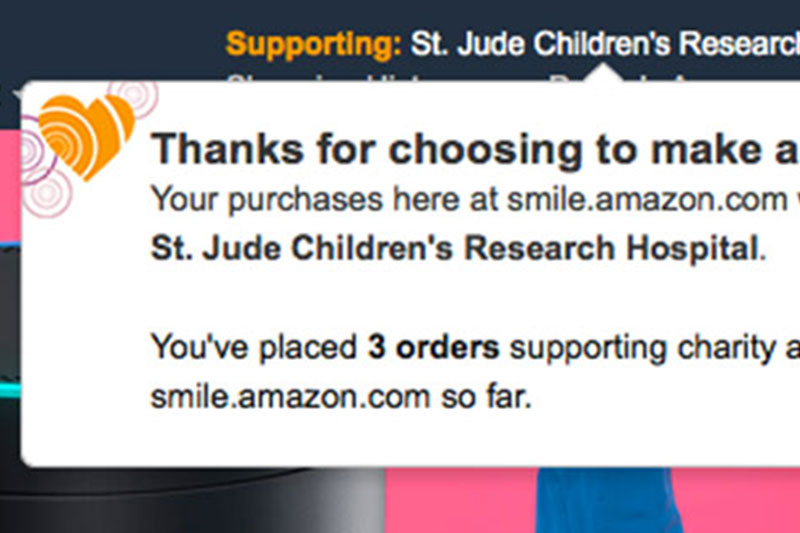
 Org Central launch AmazonSmile, Amazon
 -
 Welcome email redesign AmazonSmile, Amazon
 -
 Feature launch AmazonSmile, Amazon
 -
 Feature redesign AmazonClicks, Amazon
 -
 Heart of Haiti launch macys.com
-
 UX example Gift Cards & Incentives, Amazon
 -
 Visual design example Gift Cards & Incentives, Amazon